Data |
Data table
Table 1. A snapshot of the data table used to analyze if Lake Superior's cooling effect impacts forest structure from the shoreline inland. It displays metadata, predictor, and response variables for the 10 of the 1,850 rows in our dataset.

An example of our data table can be seen above, which contains the 1,850 individual trees that we sampled across 60 plots. Our observed categorical predictor variables are exposure (EXPOSURE) and plot type (PLOT_TYP), while our response variables are tree species (SPECIES) and DHB in cm (Table 1). We also have design variables columns, which include unique ID (ID), date, and location information for each plot (PLOT_ID; Table 1).
Exploratory graphics
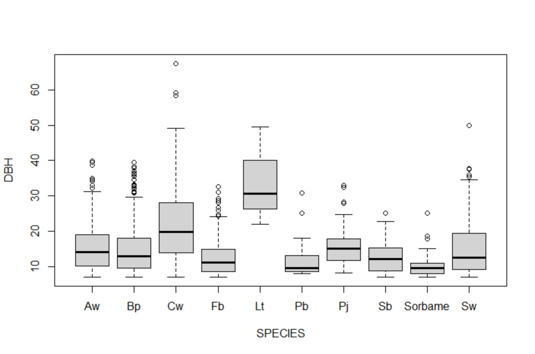
Figure 3. A simple boxplot of the DBH for each species of tree in our data set across all exposure classes and plot types (n=1,850).
|

Figure 4. A simple boxplot of the abundance for each species of tree in our dataset across all exposure classes and plot types (n=1,850)
|
We created a boxplot (Fig. 3) in base R using the plot() function on DBH values for each species across all predictor variables to briefly check for errors in data entry; this revealed if I had any unreasonable outliers (for example, failing to include a decimal in "8.9" would result in "89") and if any spelling errors created unnecessary data duplications. This figure (Fig. 3) also helped in highlighting that my data was not normally distributed, therefore I transformed my DBH data to log scale to see how this would impact the results of my ANOVA. We performed the same plot() function on our abundance data (Fig. 4) and followed up with the appropriate transformations to check how the violations of assumptions would affect our results.
Table 2. A snapshot of the data table used for our ANOVA testing for effects of exposure or plot type on species abundance.
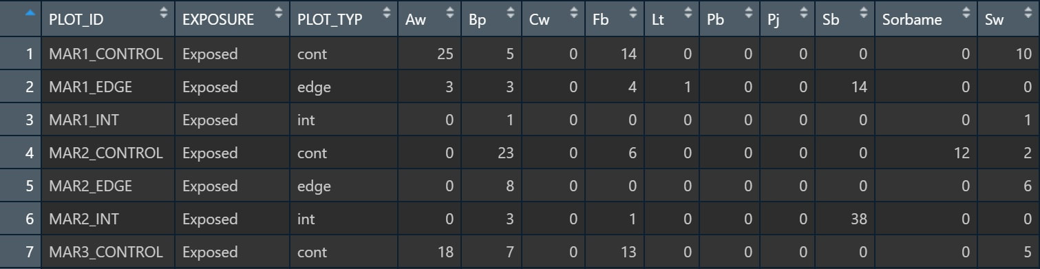
We also manipulated our data frame in order to do a proper test of individual species for our ANOVA (Table 2). In this case, we kept our predictor variables the same, but cast our species into individual columns, and used the abundance data for each cell.
